Web design & build
Your online presence is the digital shopfront for your business. Make sure you stand out with a professional-looking and performing website.
Creating crafted online solutions that engage with your audience.
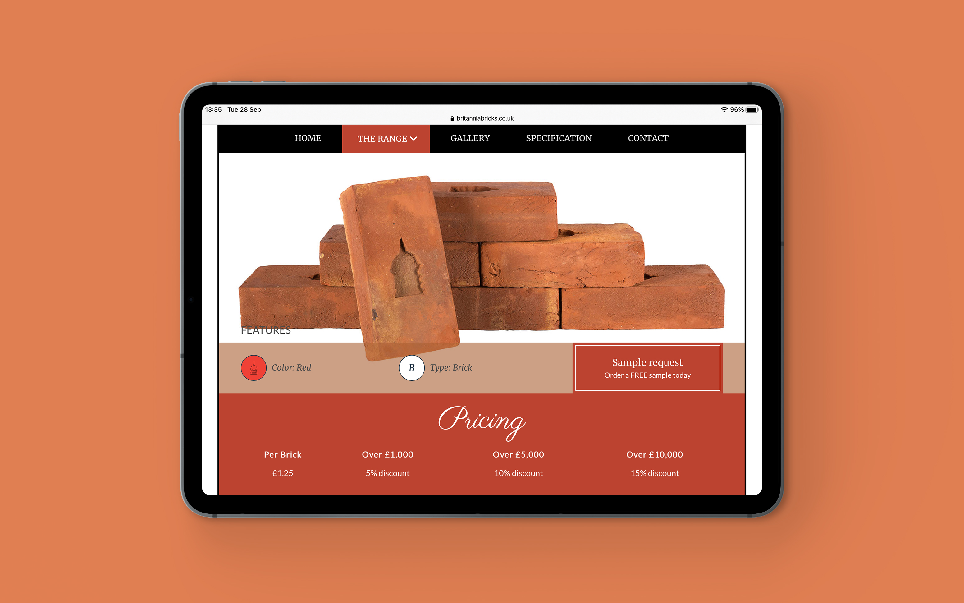
Websites are a crucial part of any business. Making sure that your online presence communicates with your audience is essential. We create websites that allow a user experience that flows through your website, making sure they find the content they are looking for as quickly as possible.
Responsive website by design.
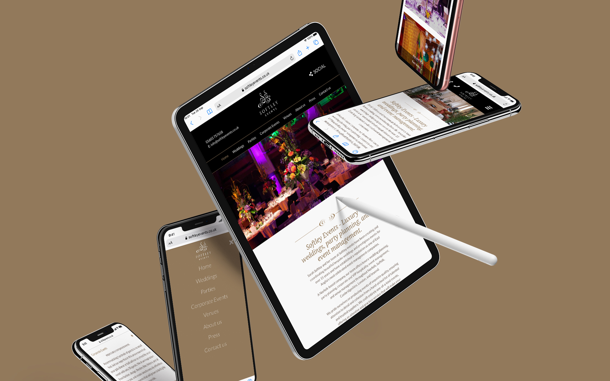
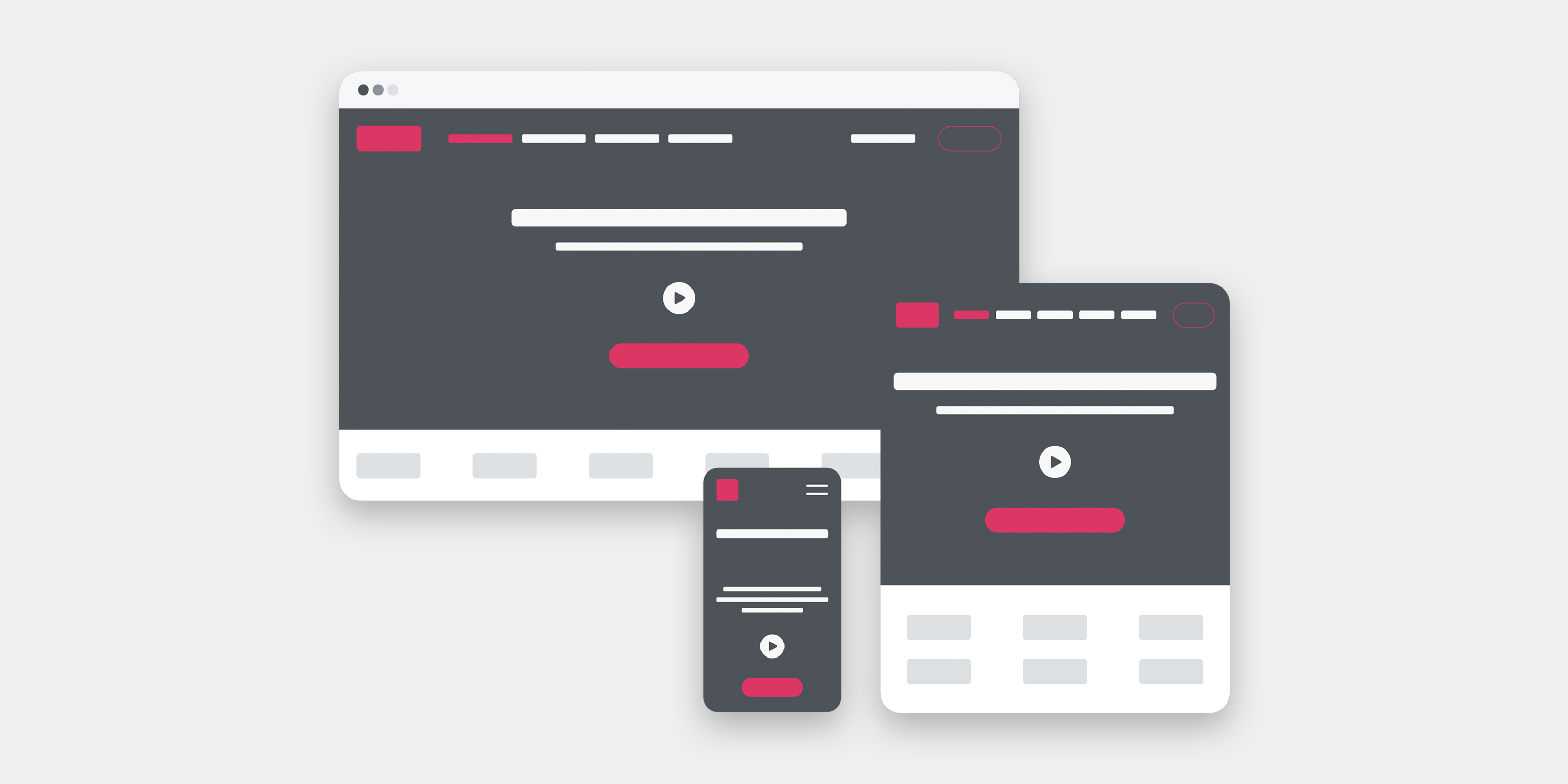
Responsive website design
An approach which suggests that design and development should respond to the user’s behavior and environment based on screen size, platform and orientation.
What is Responsive website design?
The practice consists of a mix of flexible grids and layouts, images and an intelligent use of CSS media queries. This is the building blocks of any website. As the user switches from their laptop to iPad, the website should automatically switch to accommodate for resolution, image size and scripting abilities. In other words, the website should have the technology to automatically respond to the user’s preferences. This would eliminate the need for a different design and development phase for each new gadget on the market.
Put simply, responsive website design is a new approach to the construction of websites allowing for your site to respond to the size of device your potential clients are viewing from.
The basics
The use of mobile devices to surf the web is growing at an astronomical pace, but unfortunately much of the web isn't optimized for those mobile devices. Mobile devices are often constrained by display size and require a different approach to how content is laid out on screen. Take your mobile for instance. The screen, in terms of size, is relative to your desktop computer but a fraction of the size. Its fair to assume that you are never going to be able to see a website on both devices in the same way, its just not practical or indeed possible. Consider this. What sort of device you’re reading this on? A laptop? Maybe you’re at your desk reading the words on a cinema-sized display. Or - perhaps even more likely - you're reading this on your smartphone and you’re thumbing through on your way to another meeting.
Whats the difference?
Responsive web design is an entirely different approach to constructing websites. Layouts used to conform to a screen width. This used to change all the time and of course was always a guessing game as you could never tell what a user would be viewing your site on. Nowadays that challenge still exists but responsive web design allows you to eliminate this problem by shifting the design to suit the screen the client is using. Development takes more time but its worth considering how long your site will last given this dramatic shift in the way people interact and view websites.
Our Portfolio
Our process
How we work
Contact us